Ministry of Eco Education
Helping launch the green national curriculum
Green Knight Studios stepped into the education sector for the first time with a branding and website project for the Ministry of Eco Education, which is an excellent example of just how wide-ranging the opportunities are to establish and grow brands with green credentials.
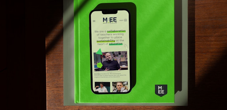
Our challenge here was twofold. First, we needed to create a credible brand identity that would appeal to teachers while conveying the lively, activist spirit that drives MEE. The second part of Green Knight’s mission was to build a website announcing the arrival of MEE, then scale it up to deliver the lesson content for schools joining the ‘ministry’.
We began climbing the learning curve to discover more about the brand, its personality and its purpose. MEE was set up by radical geography teacher Paul Turner and environmental activist Dale Vince to put sustainability at the heart of education in England and Wales.
To do so, MEE has gathered an astounding range of resources from reputable organisations across society. It has also written lesson plans that take advantage these materials, meet the requirements of the national curriculum and teach through an environmental lens.
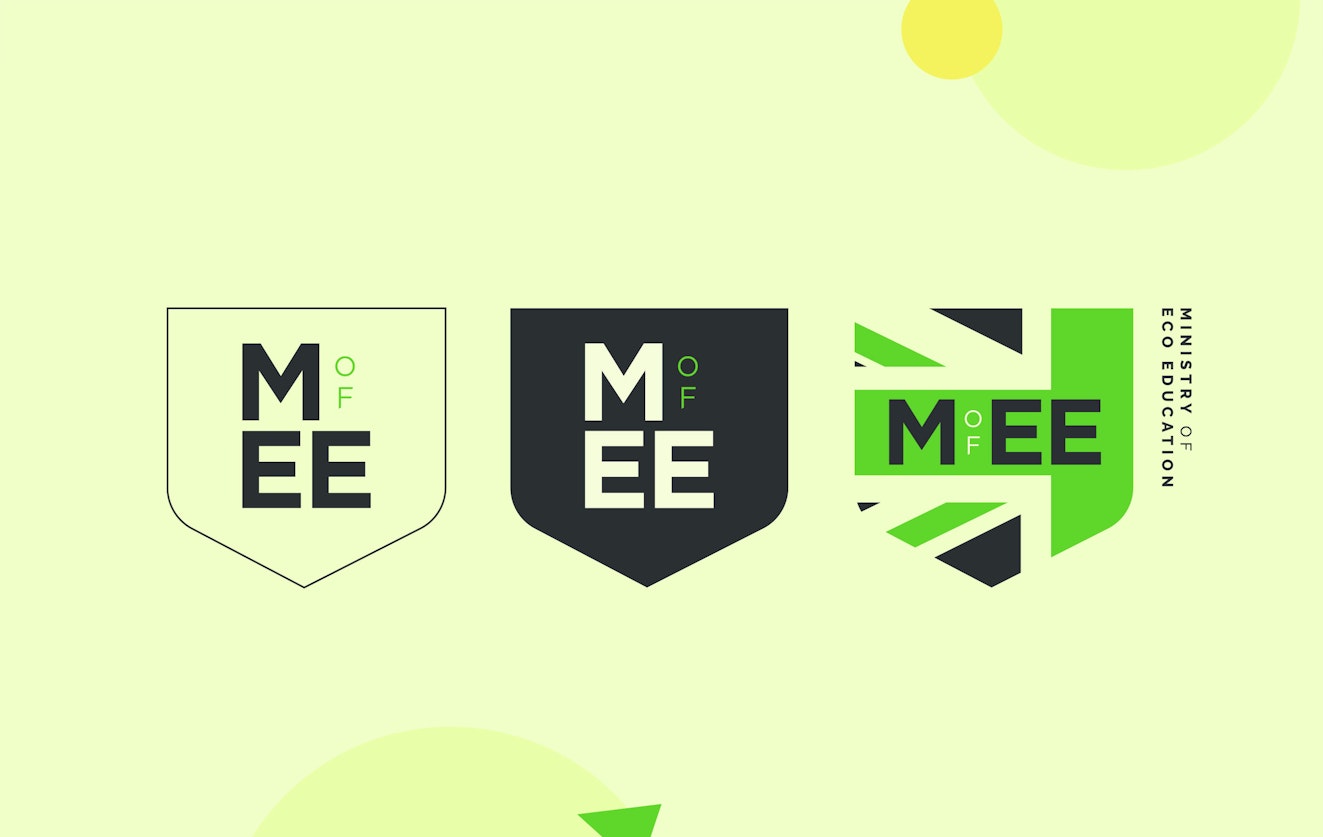
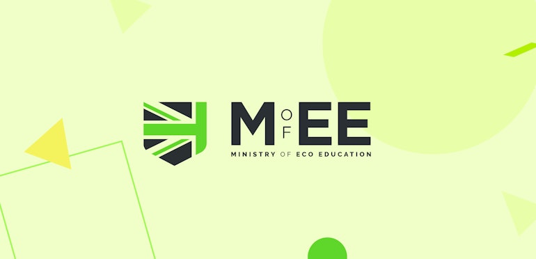
A naïve art-based aesthetic, the planet in our hands, an alternative ministry coat of arms, bold typography – several visual approaches were tested during the development of the brand identity. The strongest route, which was chosen by the client, presents the initials MEE in a clean, modern typeface, with a slice of the green union jack beneath it.
Tying in with the idea of a greener Britain through sustainability, and echoing the branding of the Green Britain Group of which MEE is a part, the union jack element provides unusual geometric shapes to use as secondary graphics across the application of the brand.
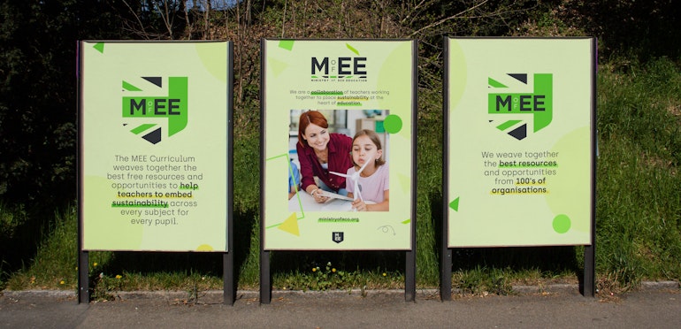
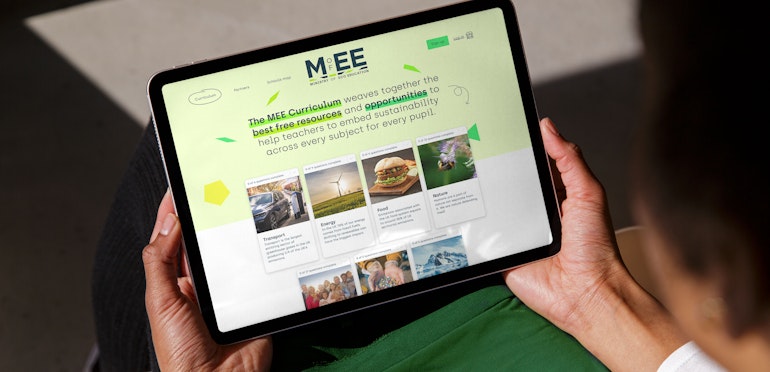
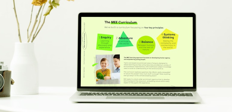
For example, these simple graphics are present in the design of the MEE website. They evolve into bright yellow and green triangles and pentagons, which are suggestive of the learning environment. Other touches include hand-drawn arrows, graph paper, hand-written captions and coloured strips that emphasise key phrases in the text like a pupil’s highlighter.
All of this generated an environment educational professionals feel comfortable with as they register their interest in working with MEE.
When the curriculum was made available, Green Knight Studio scaled up the website to deliver MEE lessons when participating schools log in. Photography with a light and optimistic tone complements the content across the key learning areas of transport, energy, food, nature, society, waste and water.
As the Ministry of Eco Education has done with its lessons, we set out to make sustainability and environmental values exciting, interesting and accessible – all qualities that are needed in the education sector.
Has it been effective? Well, since 2021, over 16,000 staff at nearly 500 schools have accessed the green national curriculum and taught it to over 298,000 young people.
View the website: www.ministryofeco.org
Scope
Brand Identity
Brand Guidelines
Content Strategy
Photography Art Direction
Illustration Art Direction
Iconography
Print Materials
Motion Graphics
Website Design
Website Development
Contributors & Credits
Copywriting:
Garrick Webster
Web design:
Attach Digital
1 / 3
“The brand and website Green Knight created for MEE has been integral to our success. In under two years, nearly 500 schools have started teaching our green national curriculum. We’re delighted.”
Paul Turner, MEE Co-Founder and Radical Geographer


With a massive thanks to Paul, Thomas, Dahlia, Helen and the whole MEE team.

